Slash: Paper Under the Knife

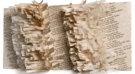
We were excited to read New York's Museum of Arts and Design will host Slash: Paper Under the Knife beginning on October 7th.  This exhibit, created mostly from artists commissioned to create a piece for specifically for MAD will showcase art made from paper to the extreme.  From the MAD website...

"Slash: Paper Under the Knife takes the pulse of the international art world's renewed interest in paper as a creative medium and source of artistic inspiration, examining the remarkably diverse use of paper in a range of art forms. Slash is the third exhibition in MAD's Materials and Process series, which examines the renaissance of traditional handcraft materials and techniques in contemporary art and design. The exhibition surveys unusual paper treatments, including works that are burned, torn, cut by lasers, and shredded. A section of the exhibition will focus on artists who modify books to transform them into sculpture, while another will highlight the use of cut paper for film and video animations."

slash

Project of the Week: The Mandarin Oriental

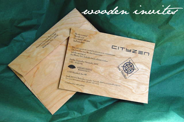
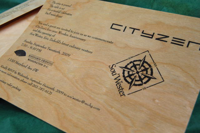
Mandarin2MandarinInviteHow fabulous are these invitations that we did for The Mandarin Oriental/CityZen/Sou'Wester this past week?

Pfau Communications came to us needing the perfect invitation to celebrate CityZen's 5th Anniversary, which calls for a gift made of wood so we took that thought and ran with it to create these invites to celebrate their anniversary and the opening of Eric Ziebold's newest restaurant, Sou'Wester.   The invites are flat printed on cherry veneer and were mailed in a coordinating envelope.  With something this special arriving in guests mailboxes, the party is sure to be solid!

A Typeface Change for Ikea

Ikea's August announcement that it would change their signature typeface from Futura to Verdana caused an uproar in the design world. typefacesAlthough the reasons for this uproar are many, perhaps what angers designers most is that Ikea's decision violates its own design aesthetic. In a way, Futura is the typographic equivalent of Ikea's furniture: spare yet functional, based on simple geometry. By rejecting a typeface which has stood the test of time (and print volume - Ikea's catalog is the third most popular publication of all time, after the Bible and the Harry Potter series) in favor of a typeface designed specifically for the computer screen, Ikea sends a different message from the one they have left unchanged for over 50 years. This medium change, mostly due to the fact that Verdana is distributed free of charge by Microsoft, could be described cynically as the triumph of a difficult market over good design.

We happen to think that the differences aren't as noticeable for the main pages which mostly feature images, but that the pages with larger amounts of body copy are dramatically cheapened; you can see the difference between the past and present designs at www.idsgn.org. An excellent article by Edward Rothstein in The New York Times further outlines the controversy.

Louise Fili, Ltd.

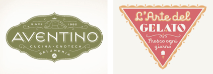
Hello everyone! I'm Christine, Haute Papier's new intern, and I'm a student at the Corcoran College of Art and Design. I'm really excited to work with Sarah, Erin, and Alison for the fall semester! I think one of the best ways to get to know someone is through viewing what they like, so for my first blog entry I want to write about a design studio whose work inspires me. Louise Fili, Ltd., based in New York, focuses on food packaging and restaurant identity. Once a senior designer for Herb Lubalin, Louise Fili has run her own studio for two decades. With only three employees, the studio has produced some of the most gorgeous retro-inspired, whimsical work I've ever seen, most pieces featuring hand-drawn type:

designs

Louise's extensive collection of vintage signage and packaging, culled from flea markets all over Europe and gifted from clients, inform her designs. "I have three interests: food, type, and Italy," she says. I think these photos of her studio basically say it all:

studio

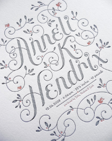
Louise Fili, Ltd.'s senior designer, Jessica Hische, is the designer behind all that hand-lettering. The work on her own website, www.jhische.com, makes me quake with jealousy, in particular because Hische herself is only 24 years old. As a freelance designer and illustrator, Hische recently created these lovely letterpressed birth announcements for a friend:

letterpress

I have to stop myself before I get carried away; this is just a sampling of things I love. I will continue to share my favorite things throughout the semester, so keep tuned!