Typefaces - 101

periodic table of fonts

So finally a Periodic Table for printers to enjoy - yes even me.  No, I was definitely not the best chemistry student much to the disappointment of my very scientific parents.   (Just to clarify this is Erin a major history and lit geek and not Sarah who is a total geek so probably aced every pop quiz on the Periodic Table of Elements thrown her way - but don't worry there won't be a quiz at the end of this post).  It's just something cool that the designers over at Squidspot came up with.  The table places fonts into "families" by column and groups the typefaces by popularity.  Of course the table only captures a small sampling of the the millions of fonts out there, but it's still tons of fun.  I'm hoping to stumble across another soon with all the beautiful scripts I'm particularly keen on.  In the meantime, I can't wait to pass someone on the street who took advantage of the gear shop at Squidspot and snatched up one of their Helvetica tees.

Project of the Week: The Mandarin Oriental

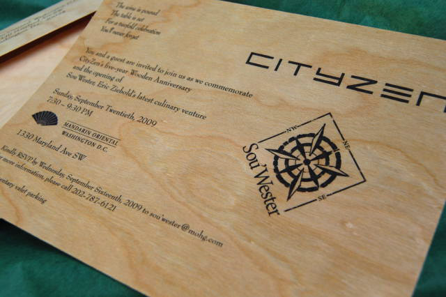
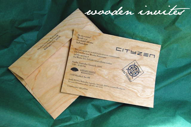
Mandarin2MandarinInviteHow fabulous are these invitations that we did for The Mandarin Oriental/CityZen/Sou'Wester this past week?

Pfau Communications came to us needing the perfect invitation to celebrate CityZen's 5th Anniversary, which calls for a gift made of wood so we took that thought and ran with it to create these invites to celebrate their anniversary and the opening of Eric Ziebold's newest restaurant, Sou'Wester.   The invites are flat printed on cherry veneer and were mailed in a coordinating envelope.  With something this special arriving in guests mailboxes, the party is sure to be solid!

A Typeface Change for Ikea

Ikea's August announcement that it would change their signature typeface from Futura to Verdana caused an uproar in the design world. typefacesAlthough the reasons for this uproar are many, perhaps what angers designers most is that Ikea's decision violates its own design aesthetic. In a way, Futura is the typographic equivalent of Ikea's furniture: spare yet functional, based on simple geometry. By rejecting a typeface which has stood the test of time (and print volume - Ikea's catalog is the third most popular publication of all time, after the Bible and the Harry Potter series) in favor of a typeface designed specifically for the computer screen, Ikea sends a different message from the one they have left unchanged for over 50 years. This medium change, mostly due to the fact that Verdana is distributed free of charge by Microsoft, could be described cynically as the triumph of a difficult market over good design.

We happen to think that the differences aren't as noticeable for the main pages which mostly feature images, but that the pages with larger amounts of body copy are dramatically cheapened; you can see the difference between the past and present designs at www.idsgn.org. An excellent article by Edward Rothstein in The New York Times further outlines the controversy.