Project of the Week: Morgan & Preston

Morgan_Blog

It certainly goes without saying that Sarah and I truly enjoy working on all our couture projects. Of course, there are some that stand out for me as especially special. I have absolutely loved this week's featured project since our first consultation with Morgan and Preston! I am struck by the elegant look of their invitation ... so much so that I've even thought that if I could go back I would probably do something similar!

Morgan and Preston are having a Labor Day weekend wedding on Maryland's beautiful Eastern Shore and they came to us to capture the style of their setting. We started with a shimmering silver/white pocket invitation folder and added a layer of a beautiful paisley designed paper in muted whites followed by the invitation piece with an elegant motif. The rsvp set, welcome note and accommodation card tucked neatly into the pocket below their mounted invitation piece. The final touch was cast on the outside of the invitation where we layered two shades of white satin ribbon and mounted a designed "M" monogram to match their return address. All was tucked in a matching shimmer envelope and sent off!

One of the best parts of our job is to get the response from our client's as their guests start to receive the invitations. Morgan and Preston were out of town when their invitations were mailed, but couldn't wait to get home to their mailbox after receiving texts from their friends applauding their beautiful invitations. Even their Mother's chimed in with great admiration for their design. We especially love pleasing the mothers!

Project of the Week: Lisa & Jay

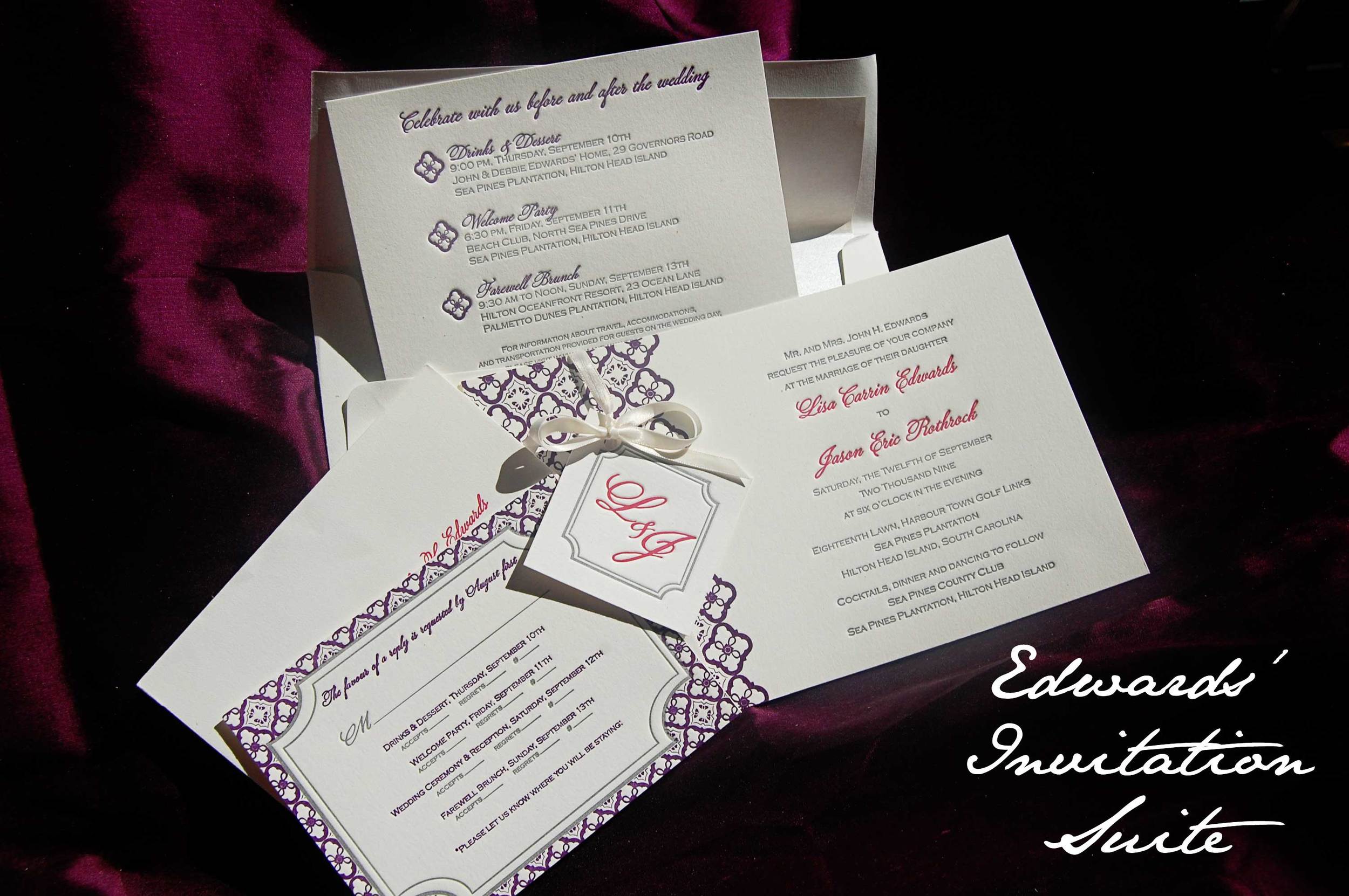
We're busy this week completing a beautiful three color letterpress wedding suite for a destination wedding in Hilton Head, South Carolina. Lisa came to us month's ago with some ideas of what she liked and a great late-summer color scheme of plum, magenta and silver. Lisa loved the idea of a combining multiple design elements into her suite for an overall creative and cohesive look. She wanted a repeating pattern, loved the idea of a monogram and had a good amount of information to fit onto a event schedule card. Inspired by her honeymoon local (a quite Mexican resort and spa), we designed a geometric "flower" similar to what is found around the property. Lisa fell in love with the suite and they'll be hitting her guests' mailboxes soon. Here's a sneak peek ...

Edwards-Invite

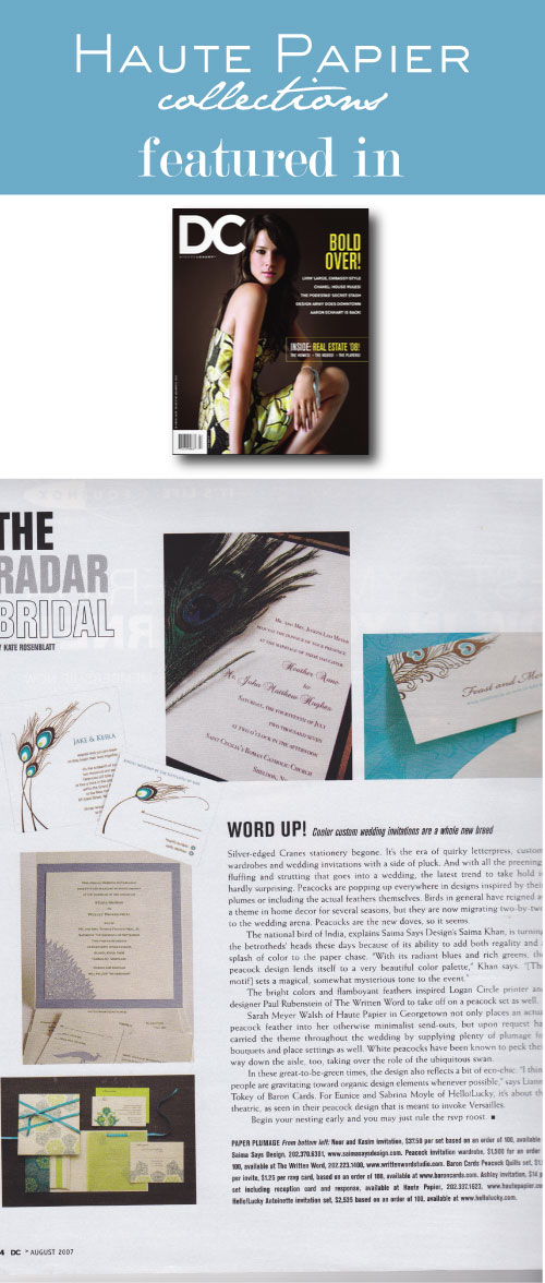
As seen in ...

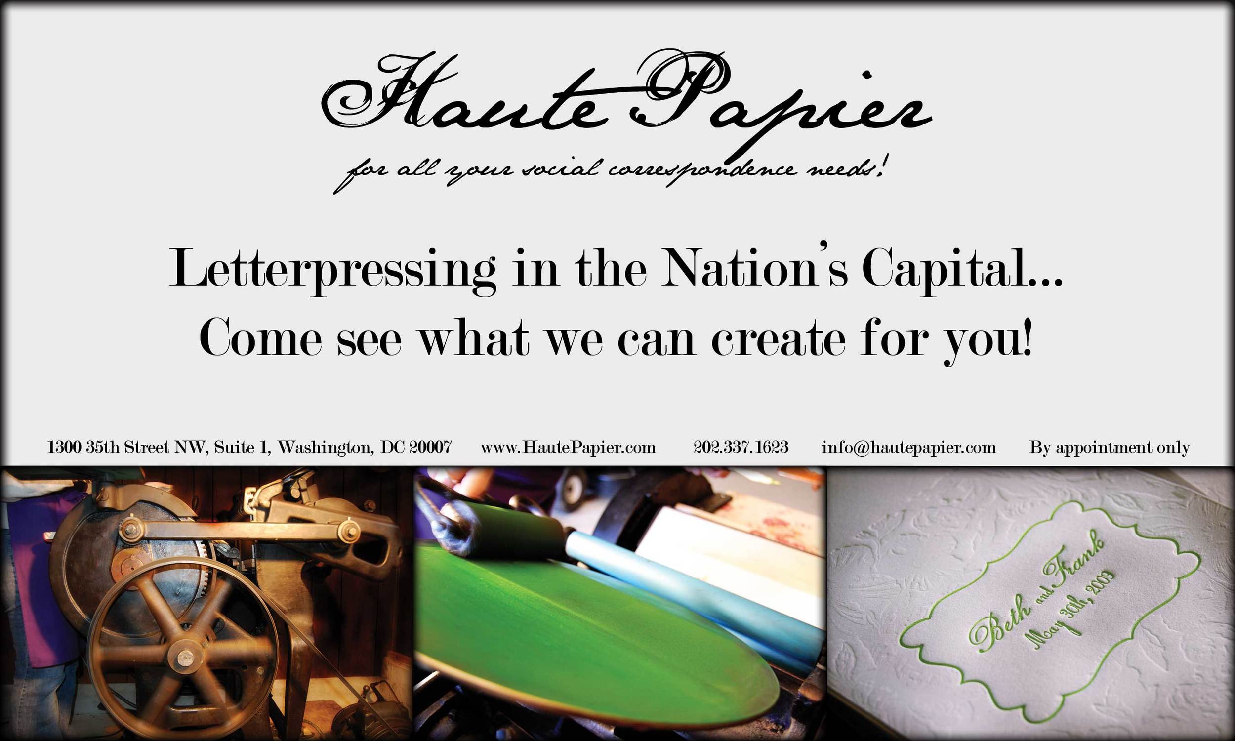
Check out our cool ad that just ran in the May issue of Washington Life.   The first picture is of Gertrude (or Gertie for short) in action.  Although all of our letterpresses have female temperaments (in just about every sense!), Gertrude is a bit more masculine looking and we needed a name to reflect her more manly stature (sorry to all the Gertrudes out there)!  We mixed the bright green for great clients Beth and Frank.  You can see their wedding program showing how beautiful blind letterpressing can truly be!

We've worked with a ton of great couples who have seen our work in Washington Life and are looking for the impress their guests with a letterpressed invitation suite.  We've also recently worked on the magazine's fabulous Young and the Guest List party!

washlifead0609