Today for Make-It Monday, I wanted to share my experiences in making your own font! For our new Bold & Beautiful line, we had to create a couple of our own fonts since some of the metal type we purchased does not have a corresponding computer font. So, to do this, we foil stamped each of our letters and then scanned them into the computer and fiddled with them as best possible in Illustrator to make them look pretty (and by pretty, I mean straight lines and the same height). This was a tedious task and the letters aren't perfect, but it will allow us to proof your orders in our foil stamp fonts to be sure you like the look before we print!
Then we places all of the little letters and glyphs in the template from yourfonts.com and then clicked create font and they did the rest! It was $9.95 for their services (well worth it, if you ask me!)
Here is our first go:

And this is our new monogram font:

and my favorite (and reminiscent of my wedding reception venue):

You can make your own font here! Let us know how it goes!
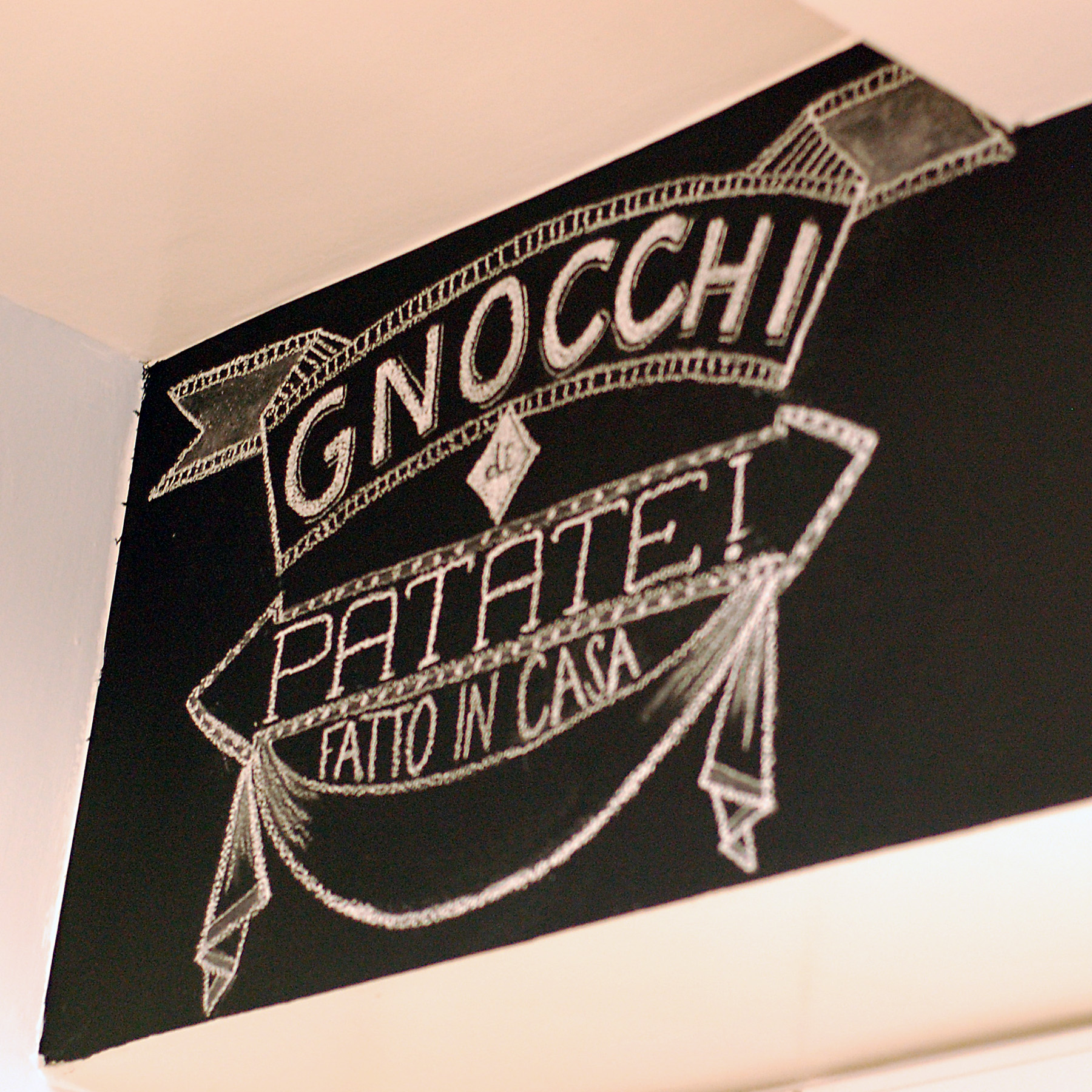
 Just a little peek inside of my kitchen today for Make-it Monday. Our all white kitchen needed a little livening up when we moved in, so I pained the top 2.5 feet of the wall in black chalkboard paint, and then started a "recipe mural" in white chalk. I'm only 1/3 done and looking forward to getting the rest of the recipe up there - maybe in the style of my new favorite font? What do you think?


